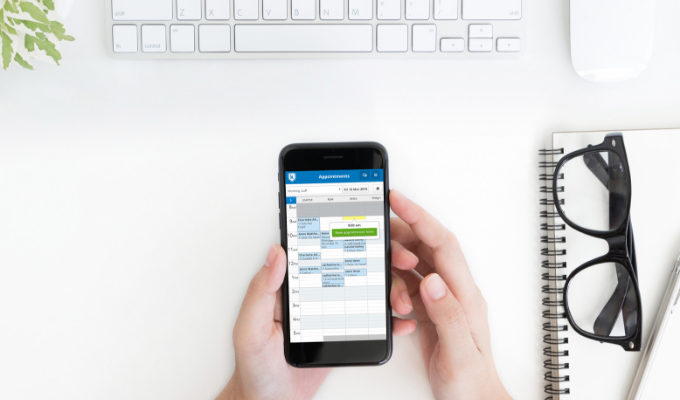
The Kitomba 1 Appointment Book is now mobile friendly. No matter where you are or which device you’re using, you can easily view and update the Appointment Book.
This blog was updated on 16 April 2019 to reflect changes we’ve made to this feature based on feedback from our customers.
See your appointments today and in the future on any device
Even on your phone, it’s now easy to see your Appointment Book and what you’ve got coming up.
You can also see as much or as little of your Appointment Book as you’d like. Pinch the screen inwards to see your whole day or week, or pinch outwards to view all the details at an appointment level.
Managing your appointments on mobile and tablet
When you use the Appointment Book on mobile or tablet, you’ll notice some changes that make it more usable on a smaller screen.
Make a new appointment
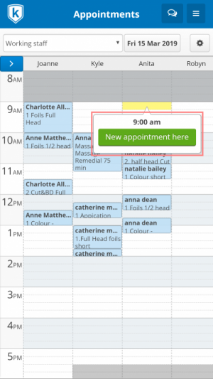
Making a new appointment on the go or while you’re with your clients is possible with a touch. Just find and tap the correct time slot, and select ‘New appointment here’.
Edit an appointment
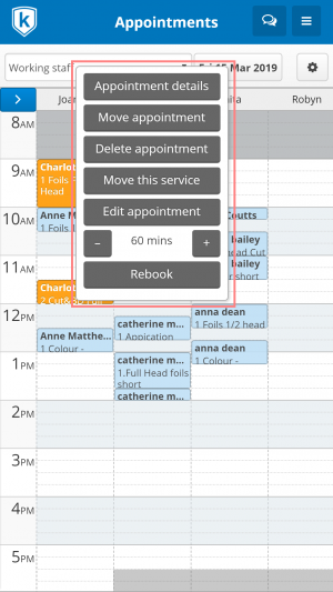
By tapping on an appointment you’ll have the option to make any change you require.
Manage Online Bookings
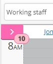
When viewing your Appointment Book on a mobile or tablet and you have a pending Online Booking, you’ll see a notification in the top left corner of your calendar. Expand the navigation by tapping on the pink arrow and you’ll be able to manage your bookings with ease.
Add or search for clients
We’ve tucked this functionality away into an expandable sidebar so these options are only available if you need them. Simply tap the blue arrow above the time column to expand the sidebar, and tap it again to hide it.
Change your view
Only see what you need to see by changing your view. In the new top navigation bar, you can quickly and easily choose all staff, working staff or an individual’s Appointment Book.
Select the date
Next up on the top navigation bar is your date selector. Choose which date you want to view with just a touch.
Choose your calendar view
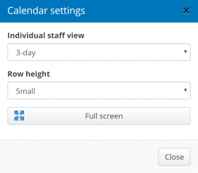
The new settings button at the top right of the screen  allows you to adjust your calendar view so it works for you.
Add the Appointment Book to your home screen
Make accessing your Appointment Book on-the-go even easier by adding it to your device’s home screen so you can open it like an app.
Visit these guides for iOS and Android.
To learn more about how the Kitomba 1 Appointment Book works on a phone or tablet, visit our support guide.
Update 21 March 2019: Based on some feedback we have received about the new mobile-friendly Kitomba 1 Appointment Book, we have made the following updates. We are also continuing to work on further improvements.
Pending Online Bookings
When you are viewing your appointment book on mobile or tablet and have a pending Online Booking, you’ll see a notification in the top left corner of your calendar. The arrow button that expands the sidebar will turn pink and show the number of pending Online Bookings.

Increased visibility of appointment time
Appointment start time will show in the top right-hand corner of the appointment to make appointment times more visible in your calendar on mobile and tablet.





Really disappointed with this update. The old system worked fine. Now I have go between 2 screens to see the daily diary and new online booking requests. Makes it’s very messy to use now. Please change it back to how it was…..
Hi Emma,
Thank you for your feedback about the difficulty of managing online bookings in the new view. We have passed it onto our product team who are looking into how to make this more usable.
I really am not happy with this update. I can no longer zoom out of the appointment book so I can see the whole appointment book in one screen. Instead, now I have to scroll across to see all the staff. And also stroll down. I can’t open an online booking and look at the whole appointment book to see where it best fits. I can no longer click next page I have to client the date and then next every time. It’s very annoying. I would prefer the old version where I can view the whole appointment book and access the day as a whole. Hopefully I am not the only one that is not liking this change.
Also….. when I am in appointment book, how do I click back onto the targets, or marketing? The button on the top left is no longer there. So I have to log back into it from the start?
Hi Amanda,
Thank you for your detailed feedback. This has been passed on to our product team.
When you’re viewing mobile friendly pages in Kitomba 1 on mobile, you’ll see what’s called a hamburger menu in the top right hand corner – it looks like 3 horizontal lines. Tap on this and you’ll be able to navigate to other parts of Kitomba 1 from there.
Please change back the mobile friendly kitomba mode! It’s sooooo bad! As least give us the option of mobile friendly or what it was before. You. Ant even zoom in or out.
Hi Gabs,
Thank you for your feedback. You can change the column height in the settings cog, which will zoom you in and may help you. As for zooming out, is that so you can see your whole appointment book? I’ll pass your feedback onto our product team and a little more detail will be helpful.
Do not like this update at all. The old version is much better. Please consider changing it back!!!
Hi,
Is there a specific part that isn’t working as you would like? More specific feedback will help our product team make improvements that will have the greatest benefit. You can also email us at support@kitomba.com if you’d prefer.
Please consider changing back to old K1. This update has made things harder not easier..
Love the update which is now also a lot faster to load. I no longer need to zoom in and out as the new setting to adjust the row height does it for you. Opening, switching photos of clients and navigate out of it is also a lot more efficient. Big thumbs up!
Thanks for the positive feedback Bianca!
This has made the calendar difficult to read with times overlapping client and treatment names, the font looks blocky, and having tap into the side panel all the time has made it a pain to manage appointments.
If you don’t want to change it back please at least give us the option to use the old one.
Hi Amy,
Your experience definitely sounds unusual – it would be really helpful if you could please send us a screenshot and info about what device and browser you’re using. Could you please email this to support@kitomba.com so that we can look into it for you?
Get any large mobile device (iPhone 7+, 8+, Xs) and look at a day with a reasonable number of appointments across 3 columns. Compare that to the previous “non-optimised” version of the page and just see how much less information is easily visible. Try managing an online booking, or rescheduling an appointment with both versions and see how it is more difficult in the “new” version that’s supposedly optimised for the device.
In this scenario (3 columns, many bookings) which I’m sure would not be uncommon to most beauty salons, the “new optimised version” truncates all the client names with “…”, doesn’t have enough room to show the treatment names clearly or at all for anything under a 60 minute booking, and the side menu when you can get it to expand requires to you scroll up and down just to see everything.
I’ve since found on iOS that using the “request desktop site” button can let me sometimes get back to the old version – you really need to have an option to just use the old version all the time.
You have made it very hard to find online bookings.
It’s hard when you actually find the online booking to see the whole appointment book to see where things fit and if you need to change anything.
You can’t zoom.
The list goes on…
Great idea, not executed well, needs a lot more work.
Hi Adrian,
Thanks for your feedback about using online bookings and zooming. This has been passed on to our product team.
This update is terrible. I have to scroll up and down to see what’s on the screen. Not sure why this was done. The previous kitomba was better and easier to navigate.
Hi Val,
Thank you for your feedback, it has been passed on to our product team.
We made changes to the Kitomba 1 Appointment Book in order to make it possible for customers to manage their appointments on any device. This is part of our ongoing work to ensure that our customers can get the most out of Kitomba by being able to use key features wherever they are. Obviously we have recieved valuable feedback on these changes which have all been shared with our product team.
Could you please change back to the old version. Online bookings was more easier to use on the old version.
This seems very similar to what we already have. I would like to see this program offer the ability to sell products and services from a mobile device
Hi Marian,
Thank you for your feedback. This update is part of our ongoing work to ensure that our customers can get the most out of Kitomba by being able to use key features wherever they are. It’s great that you want to see even more functionality added. We actually have a community where you can add and vote on feature requests – it would be great if you could please add your request there: https://support.kitomba.com/hc/en-us/community/topics/200121320-Feature-Requests
Sorry guys but this update isn’t good. Please change it back to the way it was before where you could see everything you needed without swiping or scrolling. The changes you made are time consuming and inconvenient.
I so agree withyou
I really like the more ‘minimalistic’ view, I think it’s over all much easier to use. Just wish there was a way to zoom out….
I would like to be able to see a full day view of all staff without having to scroll vertically and horizontally over the screen. The old version gave me a clear view of all staff all day – with 9 stylists I have to scroll everywhere, I do not enjoy using this. The previous version in that respect was far more user friendly.
Agree 100% with the posts already present and wish for viewing appointments to be changed back asap as it takes longer to see things at a glance. Don’t mind change if there’s an improvement but actually there’s not and it’s costly to pay for something you’re not altogether happy with
Sorry but not really loving the new update. Would have preferred the older version where you could see the whole screen rather than scrolling across. Much harder to navigate.
Hi Team
I’m another vote for the old version. Not sure why this was needed?
I can’t see the whole day as others have mentioned. I can have up to 15 staff working in one day so I have to scroll across etc.
And when I clicked once on an appt I could see the notes/make notes for my staff. Where has this gone?
Maybe we could have the option to have ‘desktop view’. Old way was great.
Kind regards, Keely
Hi Keely,
Thanks for your feedback, we’ve passed it onto our product team.
In regards to your question about where to find notes for appointments, it’s easy to find! Simply tap on the appointment, select the ‘Open appointment’ button and scroll down to see the notes field. Hope this helps!
From,
The Kitomba team